


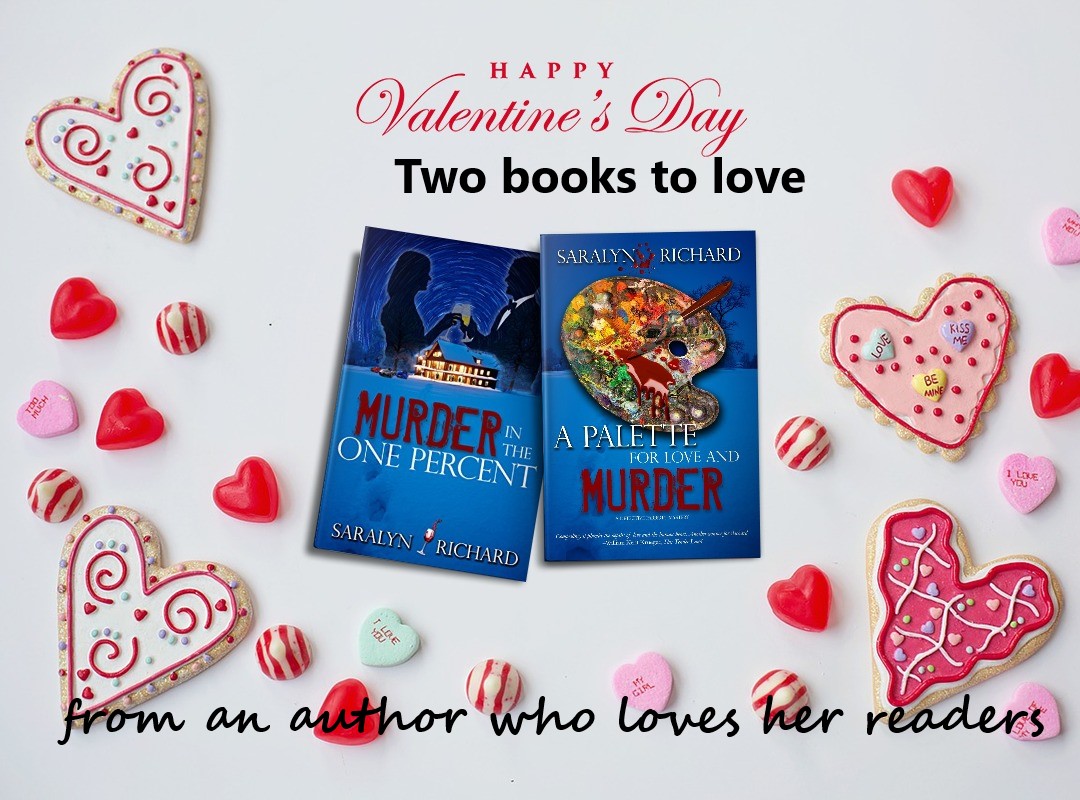
Coloration for Authors
By Guest Author, Jeanne Burrows-Johnson
As a writer and design consultant, I often focus on color. A favorite question for clients seeking branding advice is, “Have you had your color today?” This seems like a simple question, perhaps referencing a scarf or sales banner. However, my question is directed at the person’s personal preferences in color as they approach the art and science of their writing.
SELECTING COLOR
Begin by asking yourself, “What is my design aesthetic? Does my writing reflect my taste in art?” Do you like classicism’s detail or the clean lines of modern art? Do you prefer primary colors or muted tones? While the author draws on a rich palette of images within their mind’s eye, to communicate effectively, this must be tempered by the expectations of the readers of their genre.
If your writing reflects your personal voice and style, choosing artistic elements may be straightforward. If not, research can ensure colors appropriate to your genre and writer’s voice. For technical information on coloration such as color theory, colorimetry, tetrachromats, etc., visit Rainbows of Color.
- Lighting- Intensity and type of lighting affects perception of tone (the intensity of color). Color layering also influences one’s view, such as placing red on an ivory background produces a color with hints of orange.
- Region- Through character dialect, and scenes described, your text may indicate colors distinctive to locale. I’ve found Hawaiian shoreline floral greens (the setting of the Natalie Seachrist Hawaiian Mysteries) lighter than the hills surrounding `Ulupalakua, Maui. So, which greens are appropriate to your project? What about the clarity and tones of blue in the waters and skies you describe?
- Perceived Gender- This may sound dated, or even prejudiced, but examining perceptions of your writer’s voice or protagonist may define appropriate book jacket colors. Consider romance novels vs. police procedurals. In the first, you may have established an ambience classically feminine with soft, gentle, and elegant notes. In the second, there may be a hardnosed undercover police officer (male or female) who wears black, employs harsh slang, and fiercely responds to violence. While black is an excellent background for both genres, the artist’s treatment may vary considerably. The romance book often invites readers to wonder what lurks behind subtle gradations and soft strokes of mystical colors. In contrast, the police procedural usually pairs bold primary colors with dark shading within sharp modern lines.
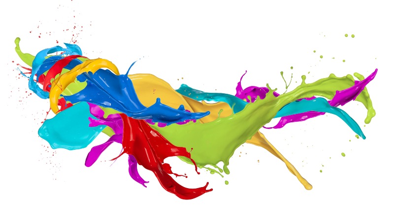
FANTASIAS OF COLOR
Consider classical and traditional interpretations of basic colors:
-
Red
Traditionally linked to sunsets, fire, blood, Mars the planet or Roman god, red is now associated with signature holidays and nations like China. It calls attention to anything depicted in it. Philosophically, it’s sometimes associated with licentiousness or Satan.
-
Yellow and Orange
Associated with the sun and gold, these bright colors are used for many attention-getting purposes. Depending on tone, they may announce deeply discounted items, or conversely, the richest and most valued products.
-
Green
Representing nature, green is often used for health and environmental topics, products, and services. It’s also used for military uniforms and equipment.
-
Blue
Speaking of clear waters and skies, blue is associated with purity and loyalty. The color is utilized by financial and insurance institutions wanting to declare their honesty, and by healthcare providers projecting dedication to the well-being of patients and clients.
-
Violet and Purple
Although these colors aren’t adjacent on the color wheel, humans perceive them as related. At the end of the visible light spectrum, violet is a less saturated spectral color displaying more blue. Purple is more saturated [purer] and balances two spectral colors, red and blue. These rich colors remain linked to ancient concepts of royalty, power, and wealth.
-
White
Achromatic color (without hue), embodying all wavelengths of visible light, white is historically linked to purity, cleanliness, goodness, and perfection. It’s a good background for highlighting all colors.
-
Black
Achromatic color, the absence of visible light. Created by mixing all primary colors, black is historically linked to darkness, night, and evil. It’s an excellent background for most colors.
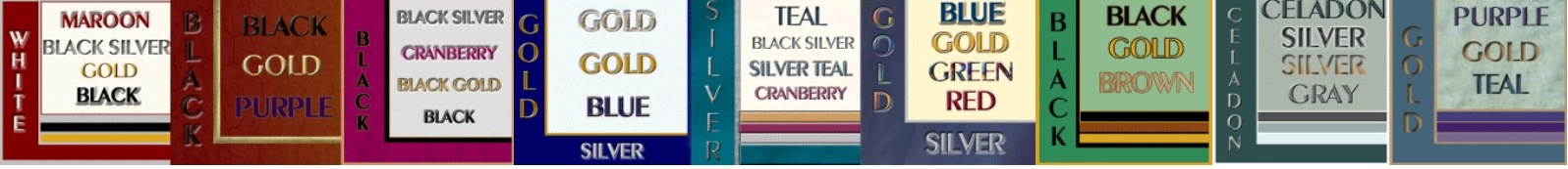
COLOR SAMPLES
Once you’ve completed researching your project’s coloration, write a paragraph outlining desired elements and prepare a sample color palette (identified by number in art or text software programs). This will facilitate communication with publishers or artists if you’re self-publishing.
Wishing you the best in your writing,
Jeanne Burrows-Johnson, author, design consultant, motivational speaker
For more blogs, visit https://jeanneburrows-johnson.com/jeanneburrows-johnsonblog.
See also, Wearing Your Brand.
Meet Jeanne Burrows-Johnson
About Becky Robinson


What People Are Saying
Someone just asked me which colors resonate for me. As a seasoned professional artist and writer (www.bethsurdut.com) my answer changes with each situation. When working in stained glass or silk with dyes, I tend towards rich colors full of lifeblood and light. When working with a client, I identify the colors that don’t appeal as well those that do.
As a wildlife illustrator in the Sonoran Desert, my palette is often that of the animals who rely on camouflage to survive, until they want to attract attention during mating, such as a male Desert Spiny Lizard, who looks like a psychedelic poster for a Hendrix concert.